Photoshop Tutorial – Using The Curves Tool

Photoshop Tutorial – Using curves to adjust image tone

The curves tool is very powerful for image manipulation. We use curves to precisely adjust the tonal characteristics of an image. In this tutorial we will explore the curves tool in its simplest form to adjust the contrast of an image.

curves-photo-original

The original photograph was taken in a room with natural lighting and it looks acceptable. However, we can add an adjustment layer to it to give the photograph a precise contrast making it warm and rich in color.

curves-photo-adjusted

The curves tool is very precise and a small adjustment goes a long way! Here is a side-by-side view of the photograph before and after the adjustment.

curves-photo-side-by-side

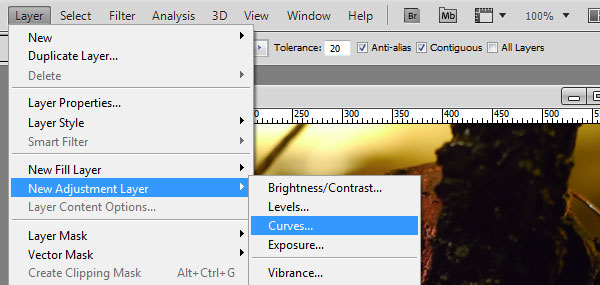
So how did we get to the finished product? It’s really quite simple. We start by adding an adjustment layer to our original photograph. From the top menu: Layer -> New Adjustment Layer -> Curves… There is also a shortcut in the layers window for this as well. We could also change the image directly without the adjustment layer however this allows us to see our effects without corrupting the original photograph.

curves-adding-adjustment-layer

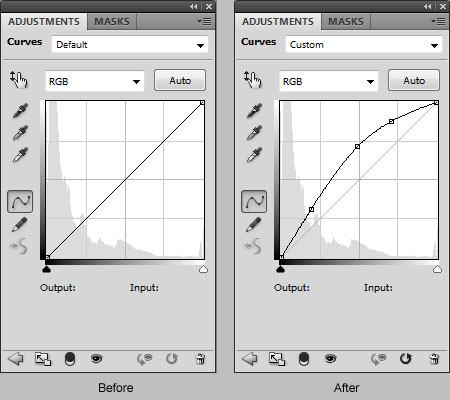
Once the new adjustment layer is inserted we manipulate the tone of the image by adding points to the “curve”. The curves window displays a histogram representing the distribution of light throughout the image. The left side is the dark the right side represents the lightness. Take note of the black to white gradient at the bottom of the chart.

curves-settings

Points may be added by simply grabbing the line at any point and moving it around. Once you have created a single adjustment point you may add others to gain the exact levels you require. Points may also be deleted as necessary just select the point and press your delete key.

This is a small sample of what can be achieved with the curves tool. Add additional adjustment layers and play with it, you may find combinations of different effects that make your image a work of art.

The Landscape after Penguin and Panda

You probably have heard that Google made major changes to its search engine algorithms in 2013. If you’re wondering what these changes mean to you, you’re not alone.

Search engines have two basic jobs. The first is evaluating and ranking websites based on the quality of their content and the authority they’ve earned from acquiring inbound links. The second is interpreting the intent of the words and phrases in the search bar and returning the most relevant results, placing the highest quality and most authoritative websites at the top. Last year’s overhaul has improved Google’s performance on both.

google_panda_penguinSo what changed last year? The SEO landscape is definitely different. SEO practices recommended by SEO experts in the past won’t work. We’ve read and listened to many posts, tweets and whiteboard presentations by Google insiders and outside experts with real tools to evaluate the results of the changes, often to an overwhelming degree. Much as you would view an impressionist painting from a distance to see the artist’s rendering of its subject, a little bit of time gives perspective to the new SEO landscape created by the changes. Here’s a summary of that landscape.

Google can more effectively identify sites with high quality original content above the fold and reward them with higher page ranks. It can also apply penalties to sites that paste together content from other sources or fill the top of the page with ads and little content. Code named Panda, this part of the algorithm goes beyond scanning meta data descriptions and on-page keywords. Think of it as “seeing” visible content on the page to determine the User Experience and assigning the subject of the page based on that visible content. No more manipulating results with keyword stuffing or writing eloquent meta descriptions with little or no real content for the User to view. Google is looking for good User Experiences…the same as you or I, as users, would expect.

Google also appears on a mission to lower the authority of sites gaining prominence from mostly purchased or self-published links and keyword-stuffed content. Think of this as the blow to those that “bought their way to the top.” An update to this algorithm originating in early 2012, code named Penguin, was implemented in early 2013. Penguin dealt a real blow to pay-to-list directory sites and aggregator spam blog sites. Is Google acting in its own best interest at eliminating these competitive middlemen? Perhaps, but you can’t complain about their efforts to stop this parasitical practice.

In a tweet about Penguin updates in October, Matt Cutts, head of the webspam team at Google, refers us to a webmaster tools blog post that summarizes the SEO landscape after Penguin and Panda well:

“While we can’t divulge specific signals because we don’t want to give people a way to game our search results and worsen the experience for users, our advice for webmasters is to focus on creating high quality sites that create a good user experience and employ white hat SEO methods instead of engaging in aggressive webspam tactics.”

It’s early 2014 and rest assured Google is working on algorithm updates. So do we sit and wait for the next round? We can’t… that is, if search results matter to the success of your business. It’s imperative to act now. The current landscape is based on solid principles: focus on the user experience and create high-quality, content-rich sites. Taking any action in either or both of these directions will only improve search engine results and more importantly improve results with Customers.

More next time on the second part of a search engine’s job: interpreting the search and returning relevant results.

Chrome’s Creative Take On LEGO

Chrome and LEGO have teamed up to create a unique and fun building tool, guaranteed to bring the kid and hidden architect out of anyone. With its clear 3D graphics and numerous options of brick sizes and colors, you can spend hours building masterpieces without having to ever tear apart and clean up as with the traditional toy.  The platform itself is very seamless and bursting with animation, allowing the user to retain clear views of their creation from whichever angle the bricks are rotated and stacked upon each other.  The possibilities of building are pretty vast and I must say that even without having ever owned a LEGO set, I found myself hooked.  Take a look at this link to start creating for yourself (please don’t blame me for hours of lost time):

http://www.buildwithchrome.com/

The program even features a builder academy to train the LEGO newbies on the tips and techniques to building like a pro.  As you progress through the lessons, you learn the art of the LEGO, including the hidden gems of the program.  You also have the option to explore other people’s creations from around the states with a map that shows you exactly where that person is located.  Meaning, once you create your build, you can share your project with the world.   It was surprising to see so many detailed models out there, each very different from the other.  I must say my starter build failed in comparison to the pros, but nonetheless, I had a great time testing the software.

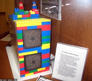
legoserverI did also learn throughout my research of this program, that Google has had a longtime connection with LEGO.  Their original storage was even housed in a LEGO unit as a cheap cabinet alternative.  This unit can still be found at Standford University today, and now the Chrome can pay homage to the beloved toy with their own online twist.

Use multiple cloud hosting companies for efficient pricing and effective infrastructure.

While the idea of managing data and applications using multiple cloud providers may sound like a nightmare to maintain – are there any benefits? One likely benefit is the removal of single point of failure within your business process. Cloud providers ranging from Amazon to Microsoft have faced outages in the past and it surely was noticed throughout the web (Instagram website was unavailable).

By putting your business processes in multiple locations and infrastructure – you will find yourself in the following situation: “Our website and applications are down but our reporting service and HR systems are still up.” Doesn’t that sound better compared to “It’s all down. We’re waiting on the hosting company to come back with an ETA.” Perhaps your reporting service is hosted in Microsoft’s Azure (SQL Server and SharePoint rigged with SQL Reporting Services) with SalesForce.com handling HR information. Just because your corporate website and product is unavailable doesn’t mean your whole company is at a full stop.

Selecting multiple cloud carriers leaves room for creative price management. Perhaps one provider is better for bandwidth while another is more flexible for storage. If the cost of managing your IT infrastructure is really a concern, selecting multiple cloud hosting company should definitely be considered. And there are solutions out there to help manage the multiple cloud environment, such as RightScale.

Further reading:

Amazon Web Services suffers outage, takes down Vine, Instagram, others with it

Designing Website Asset Caching with Scalatra

Regardless of if you spent countless hours writing pretty CSS and JavaScript or you just need to package Bootstrap and jQuery in your application the last thing you need to worry about is loading all of your assets individually. This can wreck your sites loading times and rendering performance. Scalatra being a light weight framework for building straight forward applications and API’s doesn’t come with a prescribed solution, though WRO4J can step in to assist us with this process. We will step through the configuration of WRO4J, SBT, and finally the inclusion of these into your layouts.

To configure WRO4J we will first add it into our Build.scala or Build.sbt file. We will add a dependency in the following manner:

      libraryDependencies ++= Seq(
        "ro.isdc.wro4j" % "wro4j-core" % "1.4.0",
        ...
      )

We then need to configure our wro.xml file for our Boostrap and jQuery assets:

<?xml version="1.0" encoding="UTF-8"?>
<groups xmlns="http://www.isdc.ro/wro">
    <group name='core'>
        <css minimize="false">/css/bootstrap.min.css</css>
        <css minimize="false">/css/bootstrap-theme.min.css</css>
        <css minimize="false">/css/bootstrap-glyphicons.css</css>
        <css minimize="true">/css/app.css</css>
        <js minimize="false">/js/jquery.min.js</js>
    </group>
    <group name='bottom'>
        <js minimize="true">/js/bootstrap.min.js</js>
    </group>
</groups>

Followed by our wro.properties file which defines our WRO4J usage:

cacheUpdatePeriod=0
modelUpdatePeriod=0
debug=false
disableCache=false
gzipResources=true
ignoreMissingResources=false
jmxEnabled=true
preProcessors=cssImport,semicolonAppender
postProcessors=cssMinJawr,jsMin

Now we will adjust our layouts to point to the new compiled asset:

        <link href="/assets/core.css" rel="stylesheet" />
        <script src="/assets/core.js"></script>

While this is running you should see a local development speed improvement similar to the table below. This result will be amplified when the application is running remotely in a production environment.

To make this capability suit our needs better in development and to additionally be used for Cache Busting in production we can also add a versioning output to our SBT build process. This will create a file that holds version information and a build number from our Jenkins CI, which we will use to determine the build state and to append to the URL to bust the cache.

To create our version.scala add the following code to your Build.scala file:

lazy val project = Project (
    ...
      // put this in your build.sbt, this will create a Version.scala file that reflects current build state
      sourceGenerators in Compile <+= (sourceManaged in Compile, name, organization, version) map {
        (sourceManaged: File, name: String, vgp: String, buildVersion) =>
          import java.util.Date
          val file = sourceManaged / vgp.replace(".", "/") / "Version.scala"
          val code =
            (
              if (vgp != null && vgp.nonEmpty) "package " + vgp + "n"
              else ""
              ) +
              "object Version {n" +
              "  val namet= "" + name + ""n" +
              "  val versiont= "" + buildVersion + ""n" +
              "  val datetimet= "" + new Date().toString() + ""n" +
              "  val buildNumbert=""+System.getProperty("BUILD_NUMBER", "MANUAL_BUILD")+""n" +
              "}n"
          IO write(file, code)
          Seq(file)
      }
    )
)

We also need to make sure that Scalate will see this class in scope during runtime.

In Build.scala replace:

            Seq.empty,  /* default imports should be added here */

With:

            Seq("import "+Organization+".Version"), /* default imports should be added here */

Now we can update our layout file with a condition that will automatically switch between development and production inclusions of our assets with a Cache Busting scheme.

    #if(com.omnispear.example.assets.Version.buildNumber=="MANUAL_BUILD")
        <!-- Bootstrap core CSS -->
        <link href="/css/bootstrap.min.css" rel="stylesheet" />
        <script src="//ajax.googleapis.com/ajax/libs/jquery/1.10.2/jquery.min.js"></script>
    #else
        <link href="/assets/core.css?v=<%=com.omnispear.example.assets.Version.buildNumber%>" rel="stylesheet" />
        <script src="/assets/core.js?v=<%=com.omnispear.example.assets.Version.buildNumber%>"></script>
    #end

To verify your BUILD_NUMBER handling will work and be passed from Jenkins or your other build system of choice you can run the command example below. Then verify that your assets have switched properly and you are seeing minified and gzipped responses.

./sbt -DBUILD_NUMBER=234 "container:start" "~ ;copy-resources;aux-compile"

An alternative solution would be to use the SBT WRO4J plugin. However, we feel the above method is slightly cleaner and easier to work with for our development process.

The example project for this is available on github. We also would like to thank those whom helped with the initial help with the generation of the Version.scala.

Photoshop Tutorial – Custom Shapes

Custom shapes are vector-based objects which add an endless array of possibilities to your designs. Photoshop by default has a basic set of shapes which includes arrows, star-bursts, speech bubbles and other random objects. These items are handy but on occasion we need something completely unique.

In this tutorial we will explore the creation of our own custom shapes. For this example we are going to take a rather small raster icon and convert it to a vector shape. We start by opening up our image and selecting the pen tool. The pen tool has a few options once selected. Make sure the “paths” option is selected otherwise the shape you create will automatically “fill” with the selected foreground color making the process more difficult.

Pen Tool

Create the initial object outline using the pen. You should make this outline as detailed as possible since the shape you are creating will be a vector object which may be scaled to a very large size showing any inconsistencies. Our first path outline illustrates how a basic shape may be created. Although for this particular item it needs more detail.

outline-basic

Here is an example of the shape that would be created if we had just stopped here:
shape-basic

Take note of how it resembles the original but really lacks the detail which defines the object as a microphone.

outline-advancedWe now revisit the object and outline additional parts of the microphone which will add the detail needed to make our shape resemble the original more closely. You may add as much detail as needed to accomplish your specific needs. For this microphone, we decided to outline all of the “ribs” and parts of the stand including some of the reflections.

The resulting custom shape is considerably more complex which makes a better representation of the original item.

shape-advanced

You may be asking “how did it go from a path to a shape?” That part is actually quite simple. Once you have created your paths make sure the layer containing them is selected. Go to the top menu: Edit -> Define Custom shape…

shape-select

Name your new shape and it will be added to your shape library for use in any project you may need it. Select the custom shape tool from the hidden menu under the rectangle and have some fun with it!

Here is an example of our new microphone shape re-sized and colorized.

microphone-shapes

Top Trends At CES 2014

CES logoCES stands for the Consumer Electronics Show and it is the biggest show of the year when it comes to the latest in consumer electronics and innovation! The Consumer Electronics Show is held every year in early January at Las Vegas Nevada. It not only brings all of the largest consumer electronics manufacturers to one place, but also some companies you may not have heard of yet.

If you follow tech news throughout the year, then you can most likely predict what will be unveiled during CES. Despite the predictions and rumors, you still managed to be surprised. The two biggest trends this year were wearable technology and TV’s.

Wearable technology has absolutely exploded in the industry in the past 2 years. With such pieces like Google Glass and Pebble smartwatches, everyone is trying to get a taste of this “new” market. Companies such as Samsung, Epson, and Razer have also been featured with wearable technology. Check out some of the product links at the end of the article.

TV’s and other home entertainment devices are always a wonder to see at CES. This year was no exception. Two devices come to mind out of all others. Vizio’s 120 inch, Ultra HD (4K) “Reference” series TVs stole the show being the biggest and most vivid of CES 2014. Samsung brought something else to the game this year, a curved TV. Using bendable LED technology Samsung offers curved screen TV’s from 55″ to 110″. They even offer a TV that goes from curved to straight in a matter of seconds.

Check out the links below for more details of these awesome products:

Marketing And Its Relationship To Information Technology

Marketing Meets ITHow often does the marketing department of a firm need to understand and utilize tools of technology today?  The answer is-a lot.  In this day and age, marketers need to not only understand the customer through research and surveying, but they also need to hone in on information in an organized way.  Interpreting data requires many technical skills that often people do not realize. The ability to create graphs electronically, run data queries and utilize a slew of programs to assemble a perfect slide deck, are vital for marketers.  In turn, the marketing goals of the business inherently shape the overall decision makers.

You won’t find a marketing department in many of the larger firms without a CRM, or customer relationship management, software in place.  These programs are often heavily customized during use to extract the most pertinent data collected through research of populations/customer bases, and analyzed for trending.  A marketing professional must truly understand what information they are looking for and know how to get the information they need – i.e. know the software inside and out.  Successful analysis requires core knowledge of a company’s current situation and department-wide goals, as well as some detailed IT-related skills.

Currently, IT departments are working more closely with their marketing arms to understand the customer, as well as their separate channels and ultimate goals. By appreciating these factors, businesses can focus on how to approach customers and the most important products to invest time and energy creating. Organizing a unified goal among departments is key for businesses to prosper, and sharing this important information requires knowledge of technology and its programs.

For a great article detailing the relationship between marketing and IT, please click on the below link:

http://www.computerweekly.com/feature/IT-and-marketing-working-together-for-business-success

Solid State Drives

If you’re interested in computing technology, you’re probably already quite familiar with the term “solid state drive.”  Solid state drives, or SSDs, are a fairly new hard drive technology that stores your computer’s data on a stationary flash medium, rather than on a rotating disk like old HDDs.  SSDs are exceptionally fast, able to achieve data read and write speeds hundreds of times faster than HDDs, and are also more mechanically reliable since they contain no moving parts.  However, as a relatively new technology, they are still prohibitively expensive for many functions.  If you’re interested in upgrading your hard drive to an SSD, though, you have several options to reduce cost.

840PROThe first option is simply to wait.  As with most new technologies, SSD costs have been tumbling, decreasing by a factor of three over the past three years.  Currently, a 512GB Samsung 840 Pro can be had for $429 or a 256GB model for $214; these prices are sure to continue falling.  If your computer’s boot time and performance are fine as-is and you’re on a tight budget, waiting to upgrade could be your best bet.

If you’re using a desktop PC, a second option is to install a small boot SSD and keep the remainder of your files on a larger HDD.  Putting your operating system and core applications on a 64GB or 128GB SSD will significantly decrease your boot time and application start time, while avoiding the prohibitive cost of a larger model.  You can then store the rest of your files on your existing HDD and take advantage of the cheaper storage space.  Unfortunately, this solution is only really feasible for a desktop PC; very few laptops have the physical internal space to accommodate an additional hard drive.

Finally, a third option that will work for almost any PC is to upgrade to a fusion drive.  A fusion drive is a single hard drive that contains a small SSD partition and a larger HDD partition.  The drive firmware automatically moves your operating system and most frequently-used files and applications to the SSD portion, providing rapid access to the things you need most, and stores the rest on the larger HDD portion.  Fusion drives offer read/write speeds that can approach those of an SSD under optimal circumstances for a significantly reduced cost.  Additionally, fusion drives can be installed in laptops as well as desktop PCs, since both the SSD and HDD sectors are contained in a single drive enclosure and exposed to the operating system as a single hard disk.

As SSD prices continue to fall, this exciting new technology will become affordable for more and more computer users.  Here at Omnispear, we’re always staying on top of the latest technology to provide top-quality IT support to our clients.  For quotes or inquiries, please don’t hesitate to contact us.

Photoshop Tutorial – Using Clipping Masks

One of the most common techniques used in Photoshop is masking. It is used to show or hide different parts of an image, usually based on either a color or shape. Clipping masks are handy when a specific shape area needs to be revealed. We use them often when creating buttons or teaser elements that have rounded corners or special shapes that require an image as a background.

In this tutorial we will demonstrate how to create a set of teaser buttons using the clipping mask technique. We often encounter a page element that has a repetitive design or shape but requires different backgrounds to represent its unique purpose. The main benefit of this technique is that once the mask is created it may be applied to as many layers as needed to accomplish your design goal.

Our example represents a simple teaser element that has three unique categories: dining, entertainment, and fitness. Our site or application would take the user to each specific area once the element is selected. We will now demonstrate how to quickly create this example and show how it scales to as many images as needed.

Teaser Images Clipping Mask

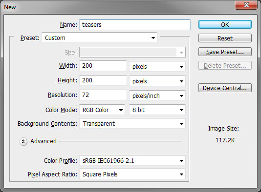
Our first step is to create a new project with our required settings. Since we generally design for the web our image will be sized to 200 x 200 pixels at 72dpi with a transparent background.

New Photoshop Document

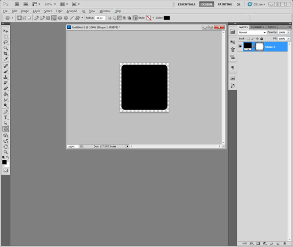
Once the image is created, we will create our button shape on the first layer using the “Rounded Rectangle” tool. It is located under the standard “Rectangle” tool, accessible by clicking and holding the small black corner and selecting it from the additional tools list. The radius has been set to 15px which makes for a nice and clean rounded edge. Now that our button shape has been created we will proceed to adding an image to it.

Photoshop shape layer

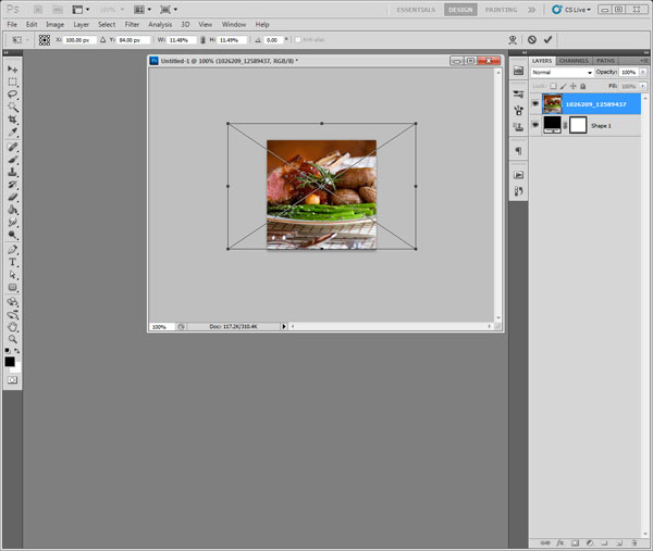
Although there are many ways of adding an image layer, we are going to go step-by-step. We will manually create a new layer by using the menu: Layer->New->Layer… This will add the new layer above our button shape. Then we will select the new layer and go to: File->Place… This will open up a browser window where we must hunt for our desired image to be “placed” on the new layer. Once it is placed, we will size it appropriately using the handles then we hit the “Enter” key to apply the transformation.

Image placement Photoshop

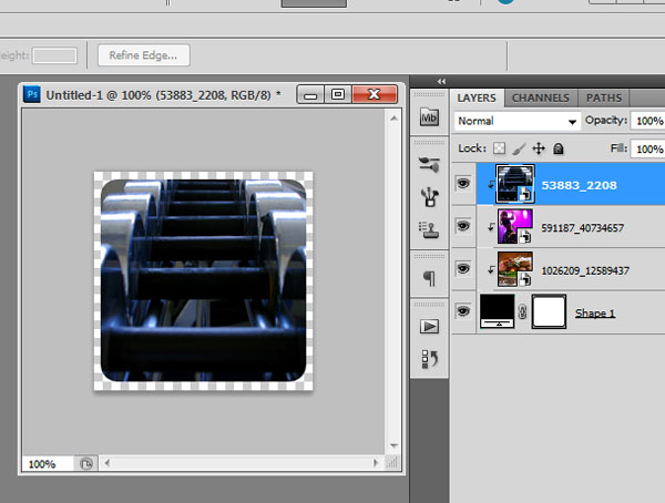
Now that our image is placed approximately where we want it, the next step is to apply the clipping mask. Our image layer should still be selected so we go to: Layer -> Create Clipping Mask. The result should be an image with perfectly rounded corners. One of the benefits to using clipping masks is that we may now move or re-size the background image as needed and the shape will stay the same! We may now repeat this technique for as many unique images as required. Keep placing new images above your shape layer and they will end up with a similar result.

Multiple layers in Photoshop

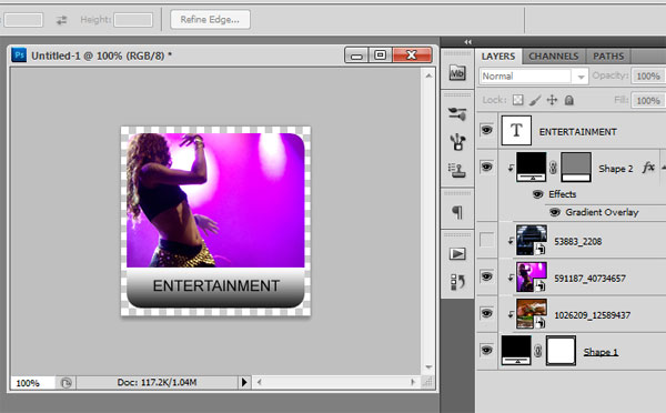
We will continue to use this technique to add the titles to each of our unique teaser elements. This is a simple design so we will add a 50px tall rectangle on the lower part of the box. We place this element above our images and our initial shape. Once positioned, we will create a clipping mask once again creating the rounded corners. Afterwards we add a text layer and our desired title to each element, save them out in the format we need and call it a day!

Completed teaser button